Colour temperature, measured in kelvin, sets how warm or cool white light looks: 2700K to 3000K is warm, 3500K to 4000K is neutral and 5000K to 6500K is cool. Colour rendering (CRI or Ra) is separate: it measures how true colours look, and Ra 90 or higher is the standard for retail, showrooms and food. Choose both together, because a warm light with poor colour rendering still makes products look dull.
Colour temperature chart
| Kelvin | Appearance | Feel | Typical use |
|---|---|---|---|
| 2700K | Warm white | Cosy, residential | Hotel rooms, restaurants, homeware |
| 3000K | Warm white | Warm, relaxed | Fashion, boutiques, hospitality, bakery |
| 3500K | Neutral warm | Balanced | Department stores, lifestyle retail |
| 4000K | Neutral white | Crisp, clean | Supermarkets, sports, electronics, offices |
| 5000K | Cool white | Bright, technical | Warehouses, workshops, car showrooms |
| 6500K | Daylight | Very cool | Inspection and industrial areas |
Most of our spot and downlight series cover 2700K to 5000K; see each product page for the options per series.
Choosing colour temperature by space
- Retail: 3000K for fashion and homeware, 4000K for sports and technology. See retail store lighting.
- Supermarkets: 3000K on bakery and meat, 3500K to 4000K on produce and aisles. See supermarket lighting.
- Hotels and hospitality: 2700K to 3000K in rooms, corridors and restaurants. See hotel corridor lighting.
- Showrooms: warm for furniture room sets, cooler for cars and technology. See showroom lighting.
- Warehouses and industry: 4000K to 5000K for alertness and clear vision. See warehouse lighting.
Keep one colour temperature per zone. Mixing 3000K and 4000K fittings in the same area looks patchy. Where you want both, separate them by zone: warm on displays, neutral on the circulation floor.
Switchable colour temperature: decide on site
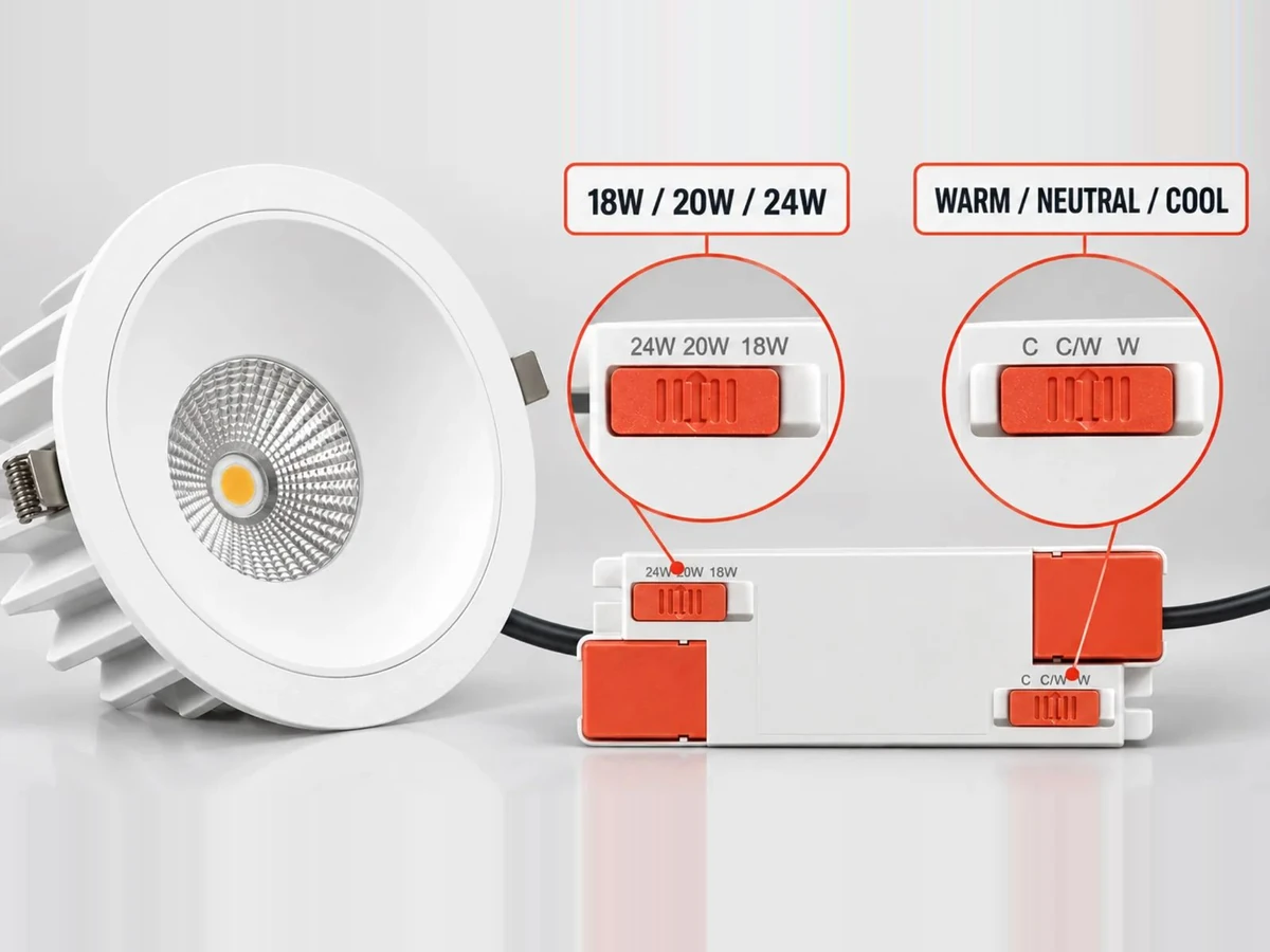
Most of our track spot and downlight series can be supplied with a switch on the fitting that selects one of three colour temperatures. The installer sets it at handover, after the space is fitted out, and a distributor stocks one model instead of three. The exact settings are confirmed per model on your quotation.
Colour rendering: CRI, Ra and R9
CRI (Ra) compares how a light source shows eight standard test colours against a reference light, and averages the result on a scale up to 100.
| Ra | What it means | Where it fits |
|---|---|---|
| Below 80 | Colours look noticeably dull | Not recommended indoors |
| 80 | Acceptable for general tasks | Offices, warehouses, circulation |
| 90 and above | Colours look true and rich | Retail, showrooms, hospitality, food |
R9 (saturated red) is not included in the Ra average. A fitting can score Ra 90 and still render reds poorly. For meat, fresh produce, skin tones and red merchandise, ask for R9 alongside Ra.
Our track spots, anti-glare downlights and grid downlights are Ra 90 or higher on the series listed on the product pages.
Colour consistency
Two fittings with the same kelvin rating can still look slightly different. Colour consistency is expressed in MacAdam steps (SDCM): the lower the number, the closer the match between fittings. For long runs of spots on one wall, ask your supplier for the consistency figure and order from one production batch.
Get the right light
Tell us the space and the products you display. We recommend colour temperature and colour rendering per zone and return a quotation within 24 hours. We can prepare a lighting layout for qualified projects.
Request a quote → · WhatsApp +86 189 9834 8092 · [email protected] · replies within business hours (GMT+8)